A Single Word, Given Room: The Quiet Discipline Behind the Slide That Says Almost Nothing

Photo: ChatGPT, Public domain, via Wikimedia Commons
There is a particular anxiety that descends over the American conference room around 9 a.m. on a Monday. It arrives with the projector's blue glow, and it looks like this: a slide holding ninety words, eight bullet points, a stock photo of a handshake, and a chart so dense it could qualify as wallpaper. The presenter reads the slide aloud. The room, already checking email, reads it too. Nobody is persuaded by anything.
Somewhere across the ocean — and across several centuries — another tradition was forming. In it, the surface is treated not as storage but as space. A single word, given room, can outweigh a paragraph. A letterform, drawn slowly, can hold a crowd the way a held breath holds a note.
The Ledger and the Canvas
Ask any American presentation designer what they're fighting, and they will describe the same enemy: the client's fear of silence. A slide with one phrase feels, to the nervous executive, like showing up underdressed. So the deck accretes. Bullets breed sub-bullets. The 10-by-10 foot of projected real estate becomes a ledger — everything recorded, nothing felt.
"The slide is treated like a filing cabinet," says Meera Rangan, a presentation designer in Seattle who has spent a decade rebuilding decks for Fortune 500 leadership teams. "But an audience can't read and listen at the same time. When you fill the slide, you're not adding information. You're adding competition."
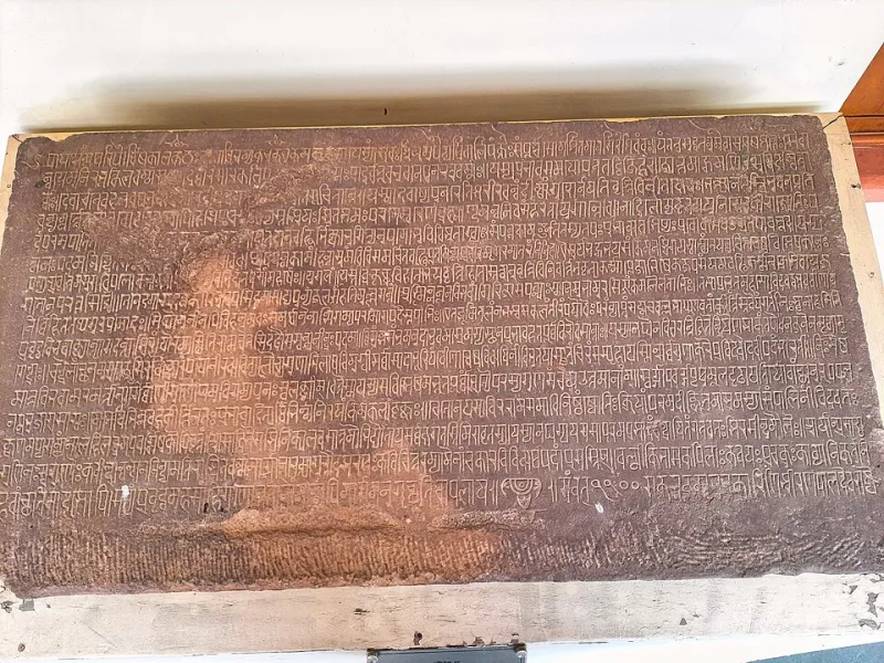
Rangan's method borrows, deliberately, from Indian visual traditions she grew up watching. The Devanagari script she learned as a child is built around the shirorekha — the horizontal line that crowns the letters and ties them together. Letters hang from it like breath held in common. There is no crowding, because the line itself organizes the page. "One governing line, and everything beneath it has order," she says. "I use that on slides. One idea. One spine. Everything else gets cut."
What the Title Card Knew
Long before PowerPoint, Hindi cinema understood the projected word as an event. The title cards of films from the 1950s through the 1970s — names painted by hand, often by artists who spent days on a single credit — did not apologize for their scale. A title like Guide or Mughal-e-Azam arrived on screen and simply occupied it. The audience settled. The film had not yet begun, and already the room was listening.
That is the effect American keynote designers keep trying to reverse-engineer with animation. But the magic was never motion. It was commitment — the confidence to put one thing on screen and stand beside it.
Sanjay Iyer, a creative director in Mumbai who consults for American tech firms pitching in Bangalore and back home, sees the difference in the first meeting. "An American deck says everything, so the presenter matters less," he says. "An Indian audience expects the speaker to carry the meaning. The slide is the frame around the speech, not the speech itself." His rule for clients preparing US pitches: if a slide can be read in your absence, it has failed. The slide should be a reason for you to be in the room.
The Breathing Letter
There is a deeper inheritance at work, and it runs through calligraphy rather than cinema. In classical Devanagari and Persian-influenced Nastaliq traditions, the space around a letter is not leftover — it is part of the letter's body. Calligraphers speak of the counterforms, the negative shapes inside an 'a' or a looped 'k', as load-bearing. Remove the surrounding quiet and the letter collapses.
Translate that to the slide, and the implications are radical. The whitespace is not where the design ran out of ideas. It is what makes the idea visible. A slide holding the phrase "We are not ready" — nothing else, no logo, no date — lands differently than the same phrase buried in point four of a seven-point list. The room reads it. Then the room reads the speaker. Then something like a decision becomes possible.
"The pause on a slide is the pause between verses," says Rangan. "In Indian classical music, the rest is written into the composition. It isn't the performer trailing off. It's the score." Her most effective deck of last year, for a healthcare company announcing a difficult restructuring, contained eleven slides. Four of them held fewer than five words. "The client was terrified," she remembers. "Afterward, three executives said it was the clearest presentation they'd ever sat through. Clarity felt like courage to them, because they'd never seen it."
Practicing the Shorter Slide
None of this argues for minimalism as fashion — the airy, sans-serif decks that signal taste while communicating nothing. Restraint without meaning is just emptier clutter. The traditions Rangan and Iyer draw from are restrained because they are precise: every mark earns its place, so few marks are needed.
For the American keynote designer, the practice is less about deleting than about deciding. What is the one sentence this slide exists to say? If the answer takes eight minutes of explanation, fine — the slide holds the sentence, the speaker holds the minutes. If the answer is "everything in the appendix," the appendix is where the slide belongs.
The audience, after all, is not asking for more. It is asking to be held. A screen full of text lets a room drift. A screen holding a single considered phrase — set in a typeface chosen with care, surrounded by deliberate nothing — gives the room somewhere to stand while the speaker speaks.
Shoonya, the void from which this site takes its name, is not the absence of content. It is the condition that makes content audible. The next deck that changes a room will not be the one with the most slides. It will be the one that knew, on at least a few of them, when to stop.