Where Every Word Begins: The Ancient Dot Redrawing the American Alphabet
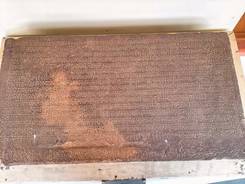
Photo: Ms Sarah Welch, CC0, via Wikimedia Commons
There is a moment, familiar to anyone who has learned to write Devanagari, that American design schools rarely teach. Before the letter comes the stroke. Before the stroke, the intention. And somewhere in the geometry of every word sits a dot — the bindu — a point so small that most of us scroll past it ten thousand times a day without a thought.
At Shoonya Akar, we spend a great deal of time looking at what design leaves out. But lately, we have been looking at something even smaller: what design reduces to a point.
The Smallest Mark With the Longest Memory
In Sanskrit cosmology, the bindu is not punctuation. It is the seed of creation — the point from which the mandala expands outward, the concentration of everything before it becomes anything at all. When a Tamil scribe drew a pulli to close a syllable, or a Devanagari hand set the shirorekha, the headstroke that binds letters like a clothesline, they were performing acts of architecture at a scale most Western typography never considered.
Compare that with the American period: a parking spot at the end of a sentence. Functional. Invisible. Typed with the right pinky and forgotten by the next keystroke.
That asymmetry is exactly what a handful of American type designers have begun to interrogate — and their work suggests the period deserves a promotion.
Foundries Learning to Draw a Point
In a Brooklyn studio that shares a building with a pickle fermenter and a letterpress collective, a small foundry has spent two years on a typeface whose defining feature is, improbably, its dot. The designers, who asked to be described simply as "a foundry of four and a very patient projector," traveled to Chennai and Varanasi on separate research trips and returned with a shared obsession.
"In the scripts we studied, the dot is load-bearing," one of them told us. "It carries meaning. It's a tittle with a job description. We came home and asked: what would it mean if the American period carried weight too?"
Their answer is a grotesque sans whose full stop is slightly heavier than convention demands — a deliberate gravitational anchor that gives white space above it a felt presence. On a poster, the effect is subtle. In a paragraph, it changes the rhythm of reading the way a rest changes a measure of music.
They are not alone. From a Los Angeles foundry experimenting with period glyphs that shift weight across a typeface family, to a Kansas City designer hand-drawing an entire display face around an enlarged terminal dot, the bindu is quietly migrating into American letterforms.
Logos Built Around Nothing
The influence has escaped the type lab. Consider the recent wave of American brand identities organized around a single point: a fintech startup whose wordmark ends in an oversized period rendered in saffron; a meditation app whose entire icon is a dot inside breathing whitespace; a Portland coffee roaster whose bags feature nothing but a bindu and the company's founding year.
Brand strategists will tell you this is minimalism. But minimalism is a style; the bindu is a philosophy. The difference is intent. Minimalism removes. The bindu concentrates. One American creative director we spoke with put it plainly: "We stopped asking what to take away and started asking what single point everything could orbit. That question came straight out of studying mandala construction."
Why the Dot Matters Now
There is a cultural reading here that is hard to ignore. American screens are saturated — feeds, notifications, badges, banners. Into that noise, the dot offers something countercyclical: a mark that asks for almost nothing. It is the smallest possible commitment a designer can make. In a discipline obsessed with systems and scale, the period is a reminder that design can be the size of a pinprick and still hold a worldview.
The mathematicians knew this. The zero that reached Europe through Arab traders had passed through the Indian śūnya — and the dot was often its first written form. Every American spreadsheet, every binary instruction humming under this article, descends from a circle that once stood for nothing, magnificently.
Type designers are simply the latest to remember.
A Second Glance at the Keyboard
None of this means American typefaces will adopt headstrokes or pulli. Scripts carry their own logic, and borrowing forms without context is its own kind of erasure. What is happening is subtler: American designers absorbing a posture toward the small mark. Treating the terminal dot not as an afterthought but as a point of origin — the place where the eye lands, rests, and begins again.
The next time you reach the end of a sentence, pause on it. One drawn point. Full stop and first light at once.
Shoonya Akar has argued before that emptiness takes shape. Sometimes it takes shape at four points of ink, and the whole page reorganizes itself around it.